UI & UX
Overview
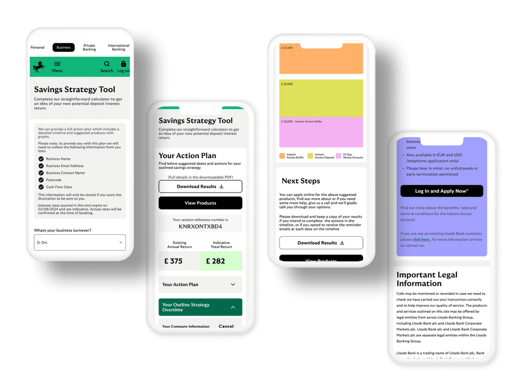
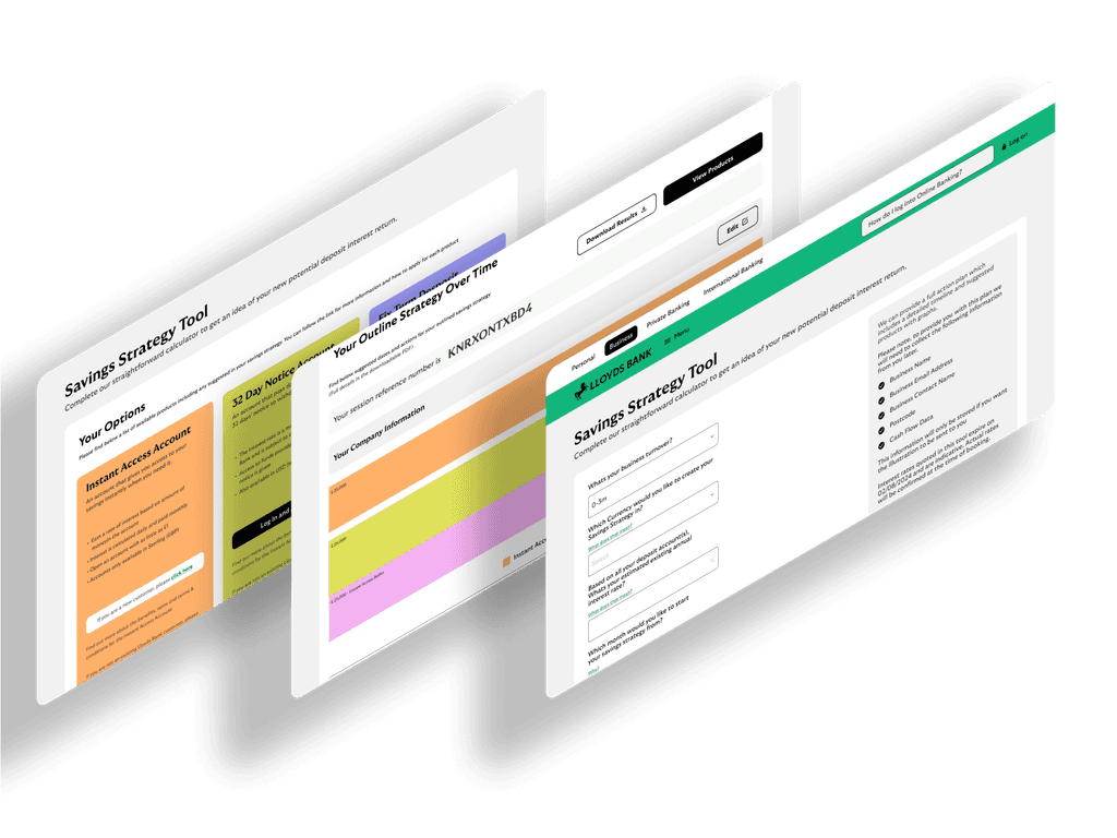
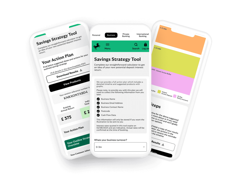
Lloyds Bank identified the need for a digital tool that would help users build savings strategies based on their individual financial goals, spending habits, and income patterns. The Strategy Savings Tool was designed to empower users to save smarter by creating personalized savings plans with a focus on user simplicity, transparency, and long-term engagement.
This UX case study walks through the design process, challenges, and solutions that led to the creation of a savings tool tailored to Lloyds Bank’s diverse customer base.
Problem
Many customers struggled with saving consistently due to:
Lack of clarity in their financial goals
Uncertainty about how much they should save
Difficulty in tracking their progress toward specific objectives
Lloyds Bank wanted to address this by providing a user-friendly digital solution that would:
Help users set clear, achievable financial goals
Recommend personalized saving strategies
Track progress automatically
Provide insights to optimize savings habits over time
Research
User Research & Personas
To ensure the tool addressed real user needs, we conducted:
Surveys and Interviews: Focused on understanding users’ financial goals, challenges in saving, and digital behavior.
Data Analysis: Analyzed user patterns from Lloyds Bank’s mobile app to identify the most common financial struggles.
Personas Creation: Based on the research, we developed three primary personas:
Emily (25): Young professional trying to save for a house but struggling to balance daily expenses.
James (40): Family man focused on both short-term goals like vacations and long-term savings like retirement.
Sarah (60): Nearing retirement and looking for a stable, low-risk savings strategy.
Competitive Analysis
We explored existing savings tools from competitors such as Barclays, HSBC, and Monzo, as well as popular budgeting apps (e.g., Yolt, Money Dashboard). Key insights included:
Gaps in Personalization: Most tools were not highly tailored to individual needs.
Lack of Clear Goal Setting: Users often expressed confusion about how to set realistic savings targets.
Poor Feedback Loops: Users rarely received actionable insights about their savings habits or suggestions for improvement.
Wireframing
We started with low-fidelity wireframes, focusing on the following:
Intuitive User Flow: Users can easily navigate through setting up a goal, receiving suggestions, and tracking their progress.
Simple Dashboard: A clean, minimal interface to avoid overwhelming the user with data.
Clear CTA (Call to Action): For goal setting and savings adjustments.
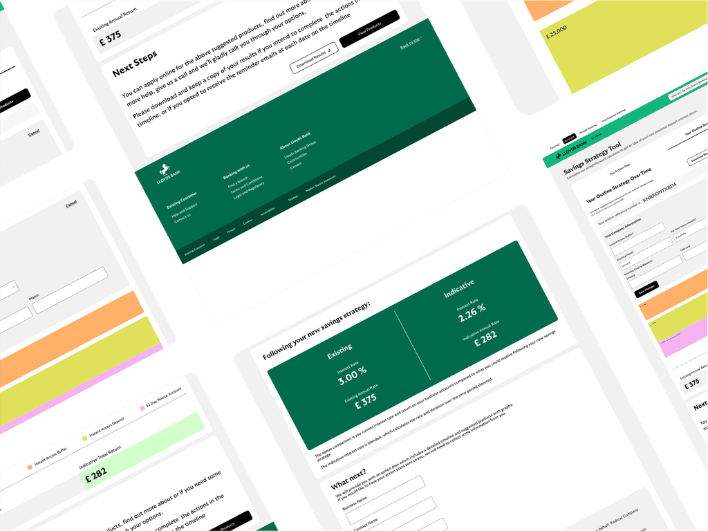
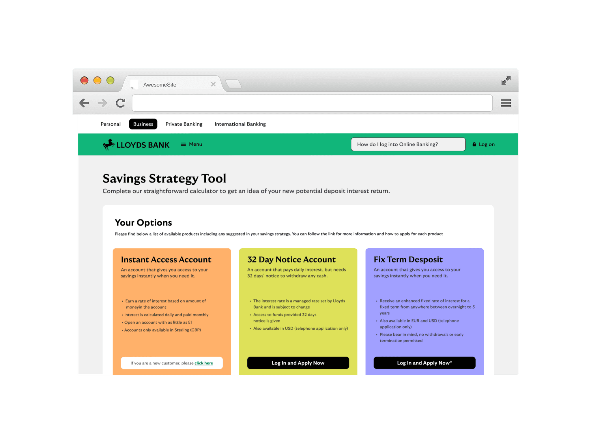
Hi-Fidelity Mockups (Mobile & Web)
reubendongre
Copyright© 2025.
