UX & UI
Sancalpa Online Store
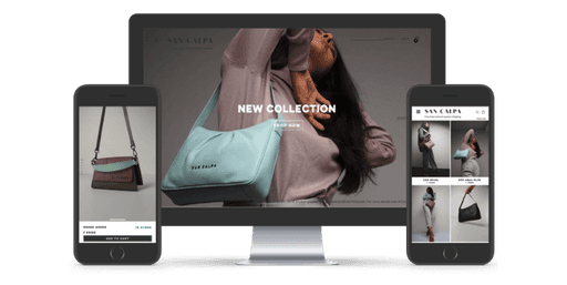
Overview
Sancalpa is derived from the Sanskrit word 'Sankalp,' meaning 'resolve' or 'determination.' With over 40 years of experience in the Leather Industry, Sancalpa embodies the classic, ever-evolving spirit of modern India.
Sancalpa celebrates Indian craftsmanship by offering handcrafted, genuine Indian leather bags available globally for anyone to purchase from their E-Commerce Website.
Pain points
Boost e-commerce conversion rates.
Continuously create fresh content.
Increase online visibility.
Broaden brand awareness and discoverability.
Reduce shopping cart abandonment rate.
Solution
Increasing Conversion Rates:
Optimize website speed: A fast website improves user experience and encourages conversions.
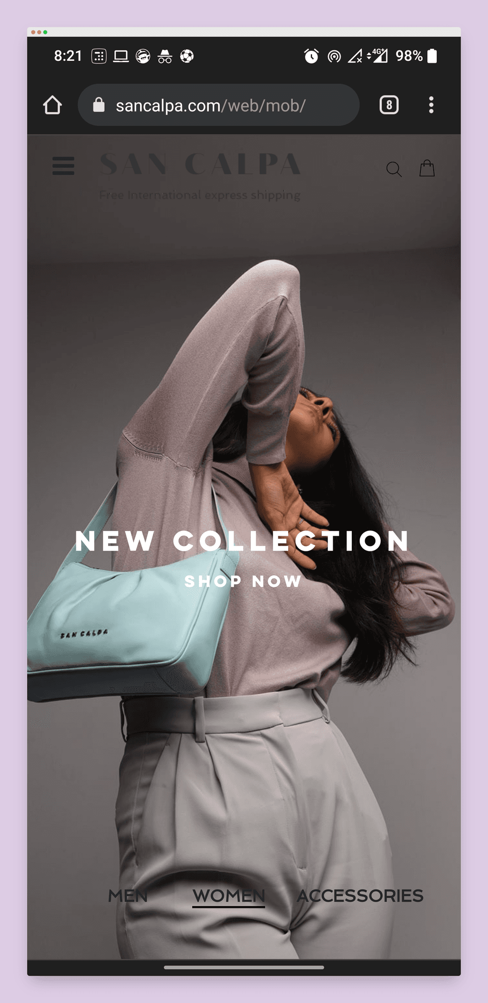
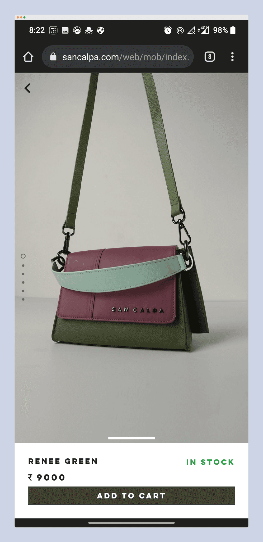
Build a strong mobile-first responsive website: Mobile users dominate online shopping, so prioritize a seamless mobile experience.
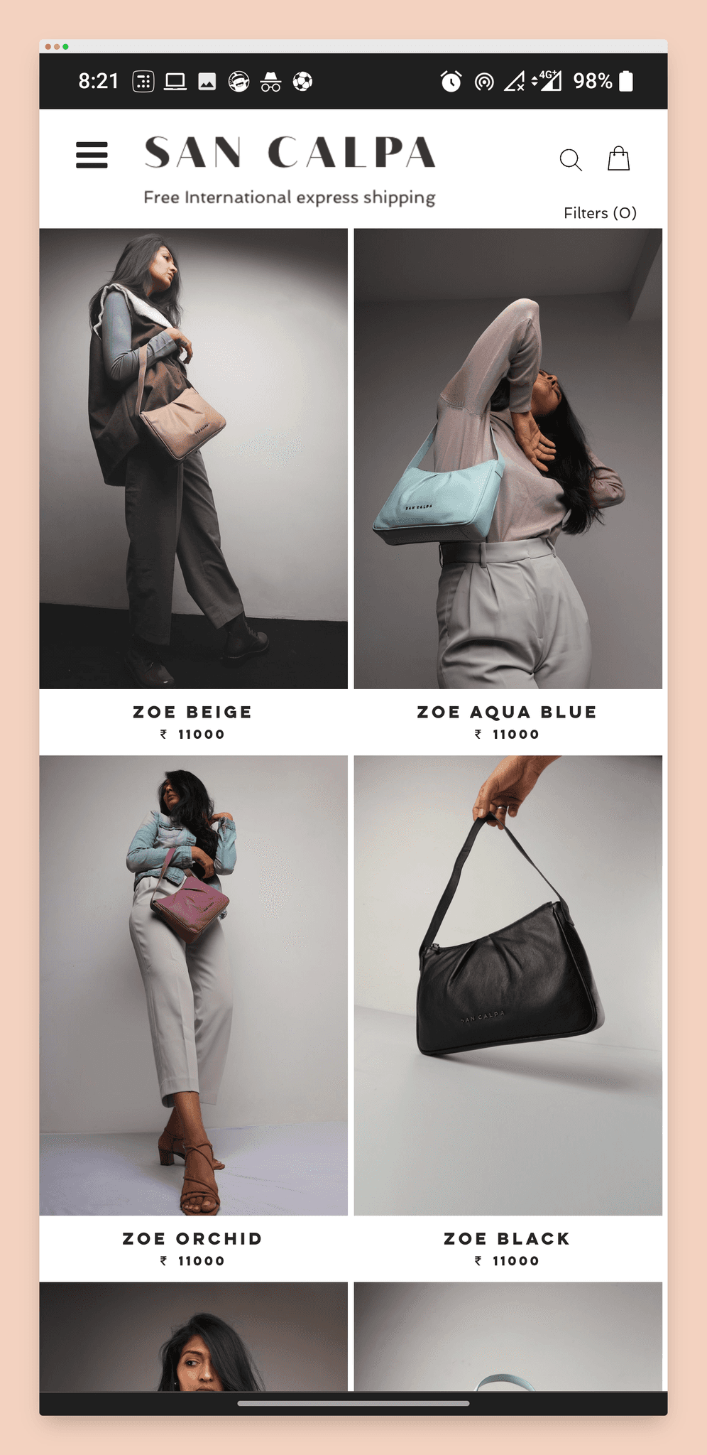
Use visually compelling model images: Showcase bags carried stylishly to attract and engage viewers.
Curating Fresh Content:
Utilize User-Generated Content (UGC): Curate fresh content from social networks with proper permissions.
Automate curation: Streamline content acquisition for consistent online visibility.
Measuring Brand Awareness:
Track metrics with each campaign: Use Google Analytics & Facebook Pixel to measure campaigns' impact on brand awareness.
Partner with influencers: Gift products to relevant influencers for organic social media exposure.
Reducing Shopping Cart Abandonment:
Optimize checkout process: Minimize clicks, remove distractions, and clearly display return policies and costs.
Preview total cost: Show all taxes, shipping, and fees upfront to avoid checkout surprises.
UX Approach & Phases
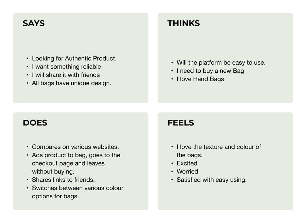
Empathy Map
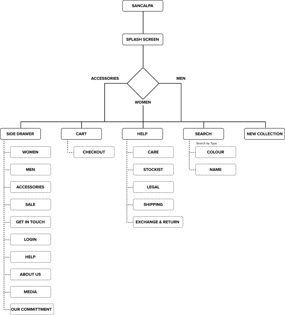
Information Architecture
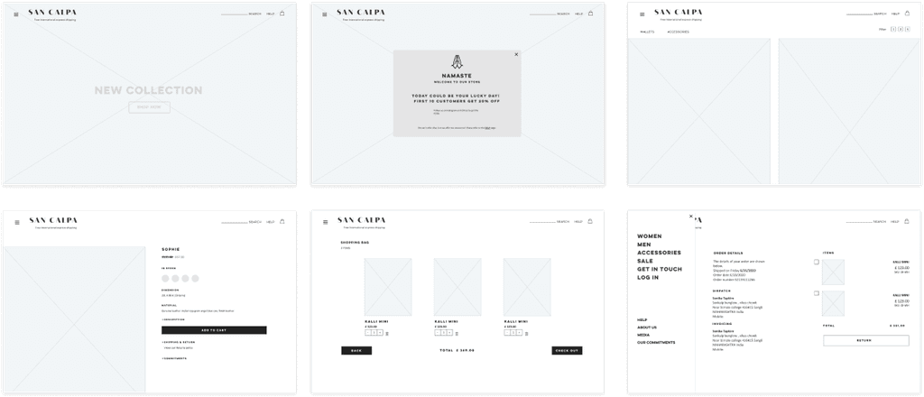
Wireframe
High Fidelity Design
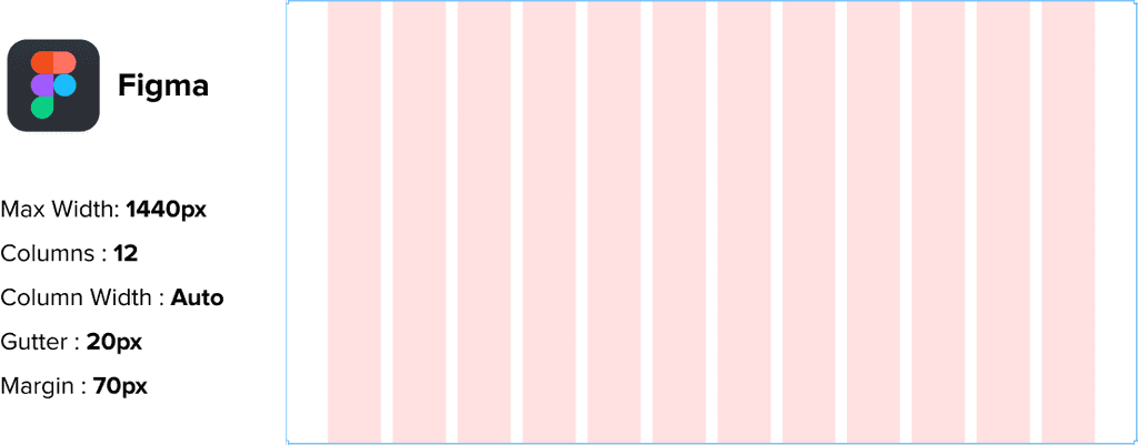
Grid System & Tools
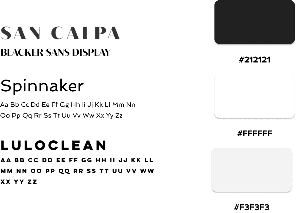
Color & Typography
Project Duration
The Result
Sancalpa underwent a complete overhaul with a brand-new frontend and backend platform. Inspired by minimalist giants like Zara, the new design prioritizes product images, placing 50% of the user's focus directly on the merchandise.
This clean aesthetic elevates the brand's image and positions it within a more premium category. Additionally, the checkout process was streamlined, significantly reducing clicks and abandonment rates.
The revamped website received overwhelmingly positive feedback, with heatmaps providing valuable insights into user behaviour. By analyzing frequently visited pages and scrolling patterns, we were able to further optimize the user experience. These improvements led to a surge in brand awareness and discoverability, ultimately boosting e-commerce conversion rates.
reubendongre
Copyright© 2025.

