UI & UX
Chorley Building Society
Overview
Chorley Building Society is an independent, mutual building society founded in 1859. They are owned and run for the benefit of their members, rather than for shareholders. This means that any profits made by the Society are reinvested into the business for the benefit of their members. Chorley Building Society prides itself on its commitment to its members and its local community.
Here are some of Chorley Building Society's core value:
Be the Best we can be
Be Respectful
Act with Integrity
Work as a Team
Ensure Every Member Counts
Problem
Chorley Building Society's website is failing to meet the needs of its users in two key areas:
Content discoverability:
Users are struggling to find the information they need quickly and easily. The current website structure or navigation may be unclear, making it difficult for users to locate relevant products, services, or updates.
Product comparison and decision-making:
Comparing Chorley Building Society's products is challenging for users. This could be due to a lack of clear product information, difficulty finding key features for comparison, or an absence of tools to help users make informed decisions.
These issues are causing frustration for users and potentially leading to missed opportunities for Chorley Building Society. By improving the user experience (UX) of the website, the Society can ensure users can find the information they need and make informed decisions about their financial products.
Enhancing Engagement with UX Improvements
1. Home Page: Banner Image
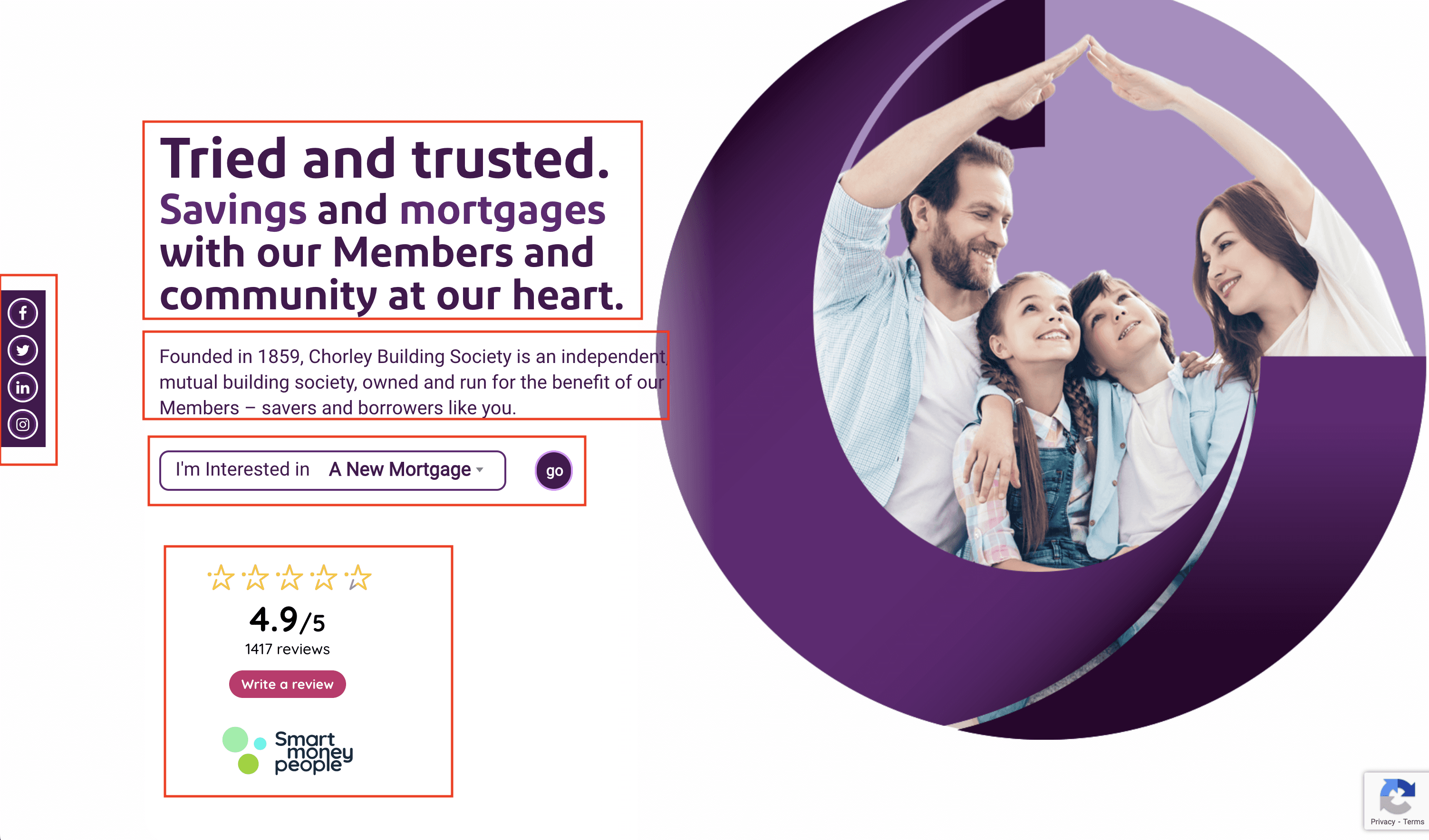
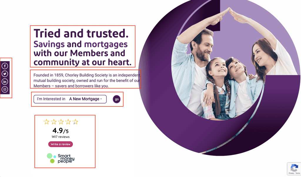
Current:
Social Links:
For better user experience, we could consider alternative placement for social links sticky panel that minimise distractions and keep users engaged on the website.
I’m Interested In:
"This action currently requires multiple clicks to access either Savings or Mortgage information and products. A more descriptive button label, such as 'View More' or 'View All Products,' would better reflect the action and improve user experience.”
Customer Review:
The Customer Review section might initially distract users. Considering the user's intent upon landing on the CBS website, prioritizing information about CBS and its products would likely be more effective.
Title & Subtext:
The title emphasizes 'Tried' and 'Trusted' in bold, larger font, overshadowing the primary focus words, 'Savings' and 'Mortgage.' Additionally, the home banner is text-heavy. The large, bold title and lengthy description might cause users to miss out on reading it entirely. This valuable space could be better utilized with a slider featuring multiple, rotating images and a clear call to action (CTA) button.
Solution:
Instead of a fixed Banner, This valuable space could be better utilized with a slider featuring multiple, rotating images and a clear call to action (CTA) button.
3. CBS Service Section Improvised
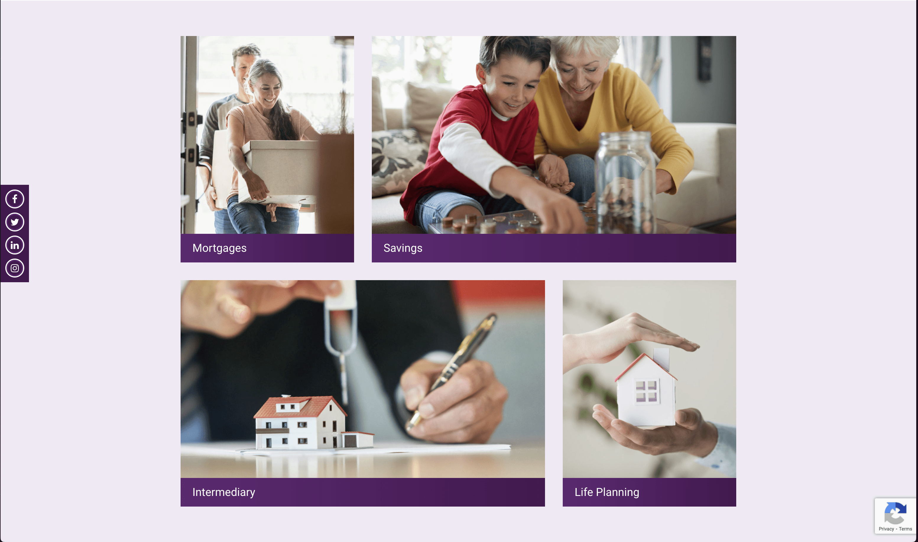
Current:
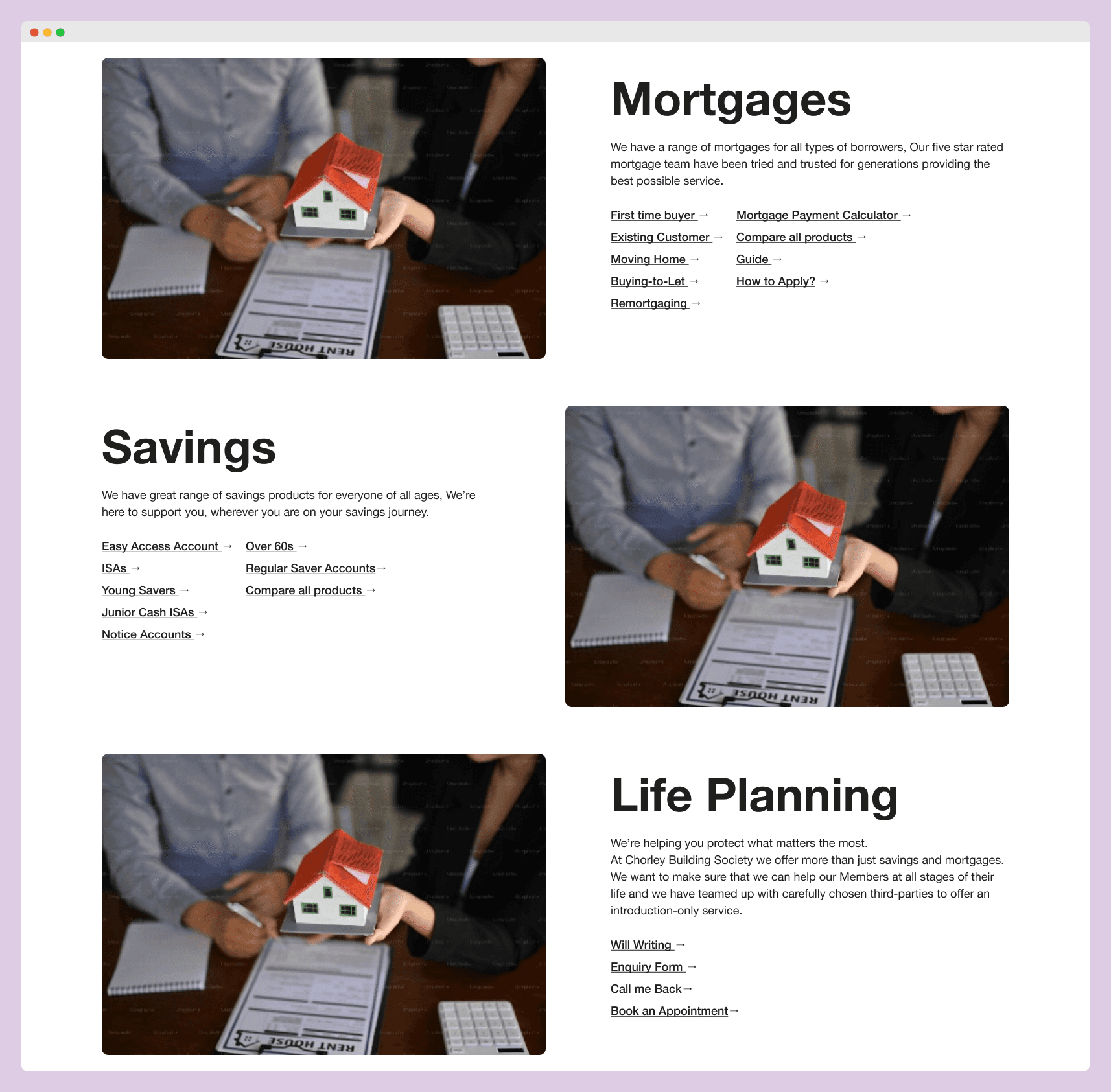
Services Offered by CBS:
"Currently, the 'Services' section (Mortgage, Savings, Life Planning, Intermediaries) displays only an image and title. To enhance user experience, consider including a sub-text explanation, a link to a comparison tool, and a list of top Savings products within each card. This would allow users to quickly scan product details, utilize the comparison tool, and explore other features directly from the homepage.”
Solution:
The 'Services' section likely excludes 'Intermediaries' because it's not intended for members or first-time users. Including it might cause unnecessary clicks and distract them from their primary goals. Perhaps the card could serve a different purpose, such as connecting members with intermediaries. I'd be happy to learn more about this section's goals.
4. Knowledge Hub Section
Current:
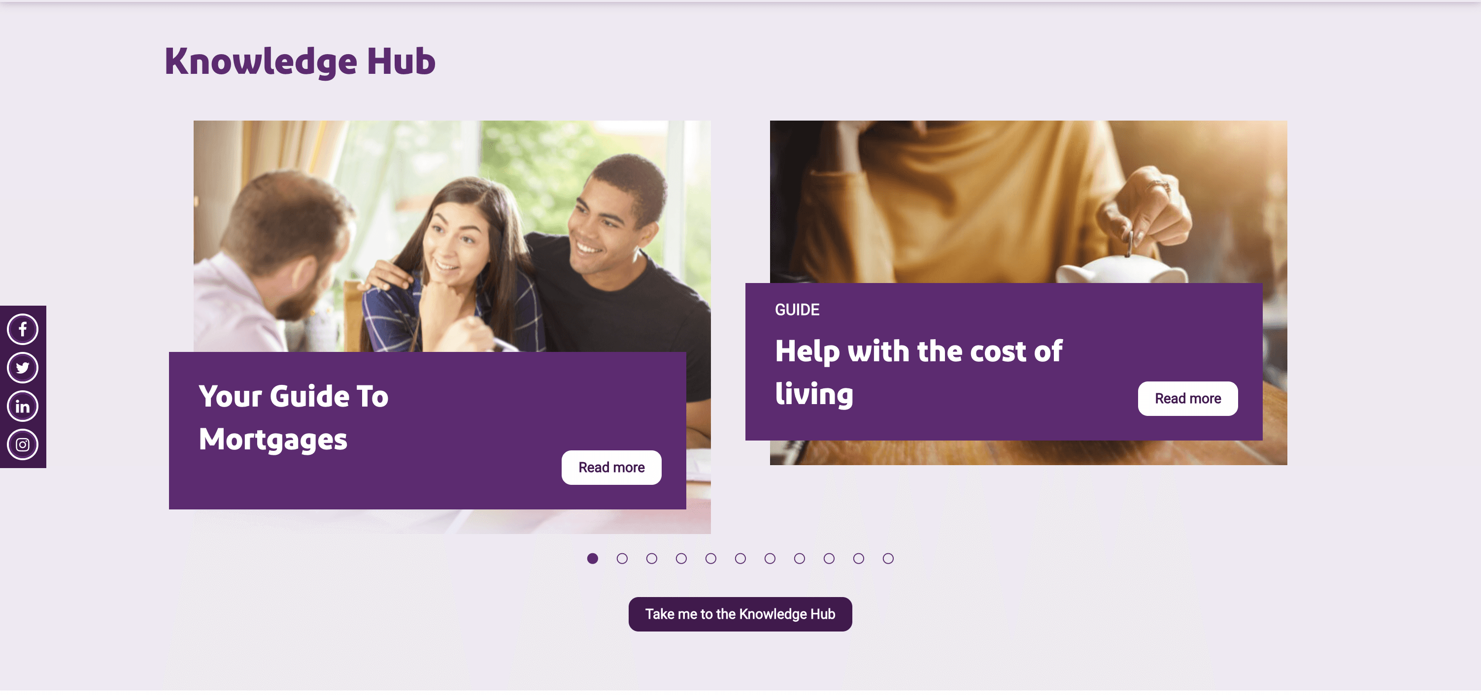
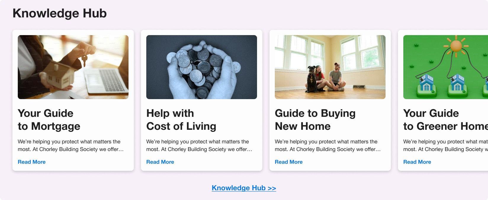
Article Cards:
The Home Page Knowledge Hub Carousel could be optimized to display at least four articles at a time instead of the current two. By reducing the size of the cards, you can fit more articles on the screen, allowing users to browse more titles without needing to slide as often.
Solution:
For improved accessibility, consider making the entire card clickable instead of just the 'Read More' button. This eliminates the need for precise clicks on a small link and enhances user experience
5. Community News Section
Current:
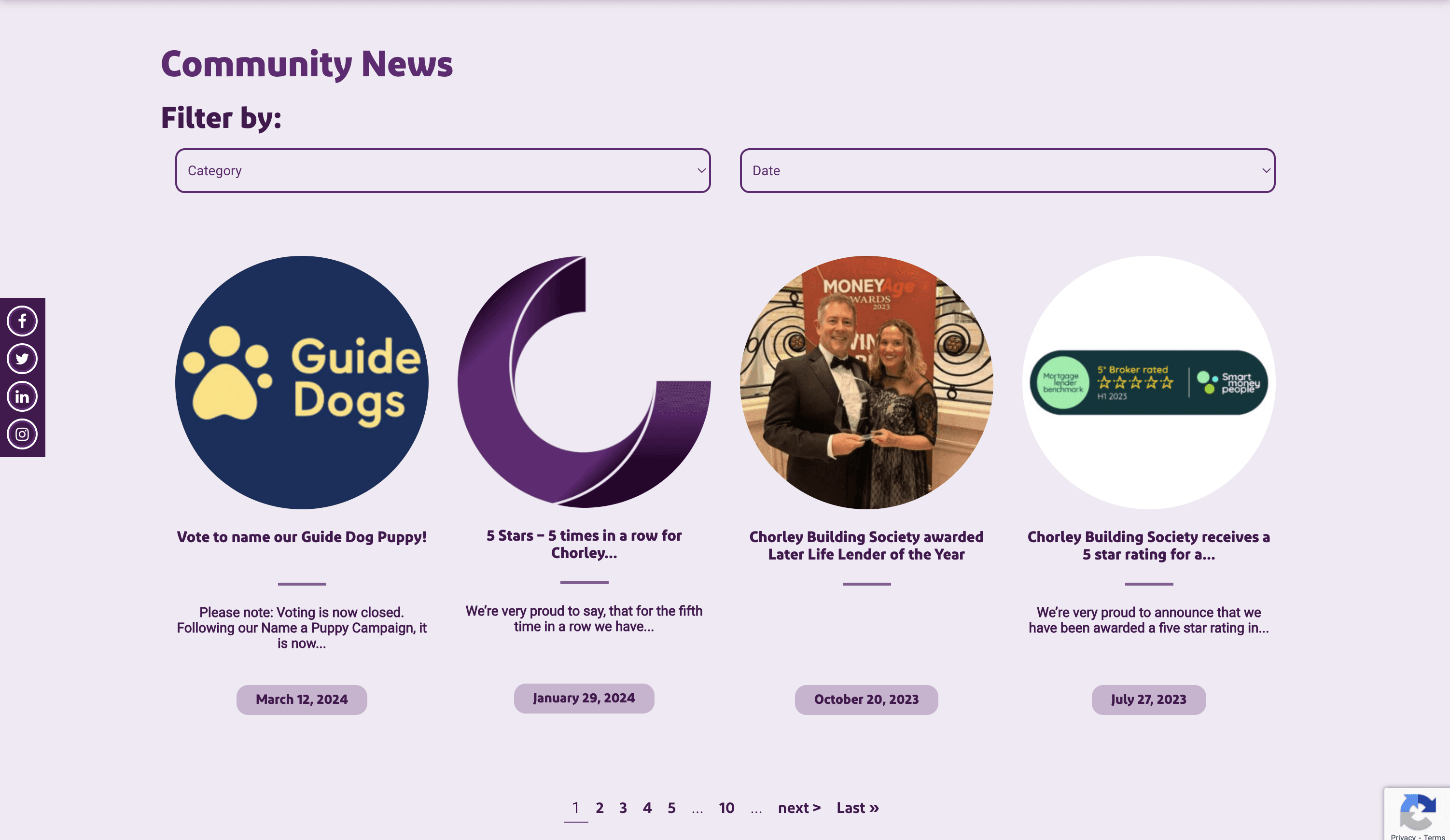
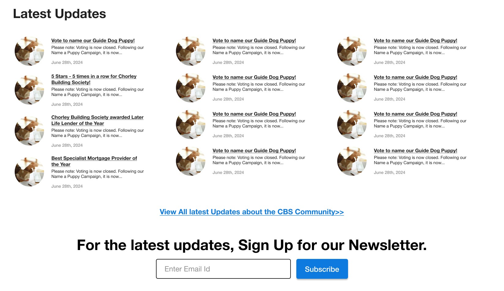
News Display:
The Community News section currently displays static images with a much larger proportion than the accompanying text. This creates a visual separation between the title, subtext, and date, making them appear like disjointed pieces of information. Additionally, while there seem to be many news items based on the pagination, users can only view four at a time.
Signup Newsletter:
Placing a signup for the CBS newsletter below the Community News section could be a valuable opportunity. This would allow users to stay informed about the latest news and updates from CBS directly in their inbox.
Solution:
Reducing image size and displaying all information together would be a significant improvement. This allows users to view more community news at a glance and complements the existing dropdown and year sorting filters effectively.
6. Request a Callback & Book an Appointment
Current:
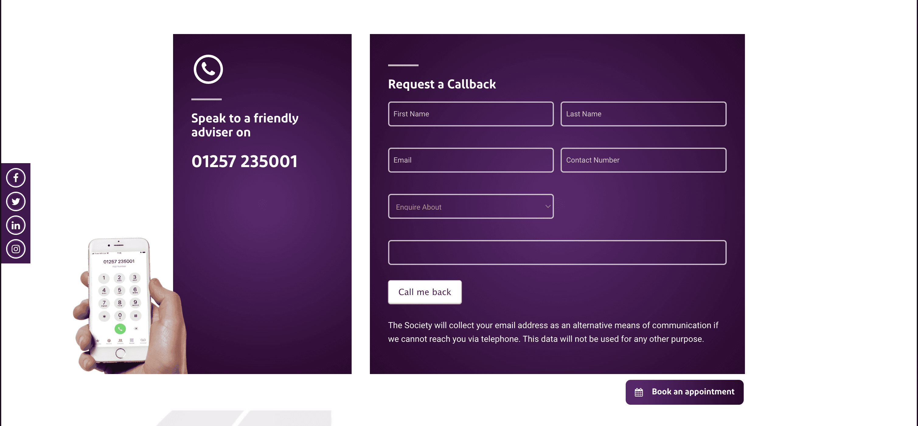
Request a callback:
This section occupies a significant amount of space. Considering a pop-up form might be a better option for users who prefer not to fill out a form directly on the page.
Empty Space :
”Speak to a friendly advisor” section has an empty space at the bottom.
Button Confusion:
'Book an Appointment' offers a different action than 'Request a Call Back.' New users might mistake 'Book an Appointment' for a ‘submit’ button for the above form.
Solution:
To improve clarity, grouping 'Request a Call Back' button and 'Speak to a Friendly Advisor' together and keep 'Book an Appointment' separate action.
7. Testimonial / Customer Reviews
Current:
Reviews:
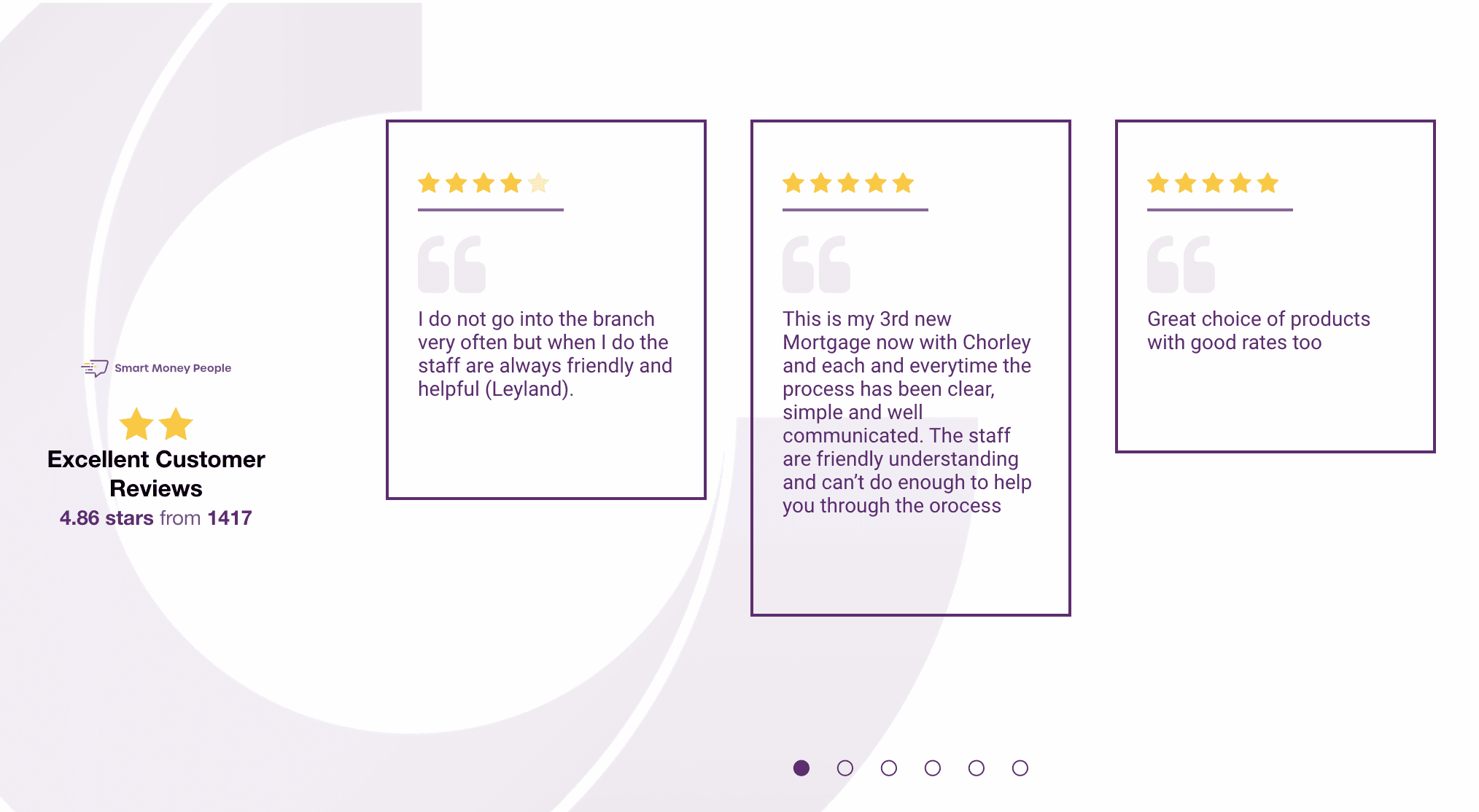
The Reviews section suffers from misalignment and positioning issues. This section also misses an opportunity to allow users to leave reviews. Additionally, there's a discrepancy between the 'Smart Money People' logo displayed here and the one on their actual website. Ideally, this section could showcase user ratings. However, it currently displays 'Excellent Customer Reviews' with two stars above and a 4.86 star rating below, which creates confusion.
Solution:
The following layout offers improved clarity: customer reviews with star ratings, along with the average star rating based on total reviews displayed to the right. Additionally, the correct logo for 'Smart Money People' and a button to write a review would be included. Positioning these reviews below the services section could potentially increase user confidence in the services offered.
9. Comparison Table for all Products from the Savings Page.
Current:
Comparison Table Missing:
The website currently lacks a product comparison tool. This can be frustrating for users who want to evaluate different options before making a decision. Implementing a product comparison tool would allow users to easily compare features and benefits of various products, ultimately helping them choose the one that best suits their needs.Savings Products:
Currently the Savings Products are displayed in boxes with missing image or icon for users to visually identify the category of product. For example, adding an elderly person's image on the Over 60's product group would make it easier to spot.
Solution:
Display Products in a nice card layout, with Icon, Title, and short Description. Make the entire card clickable. On the savings page, every product should have a separate page.
Add a "Compare All Products" button on the Home page services section. Clicking this button should take users directly to the compare page.
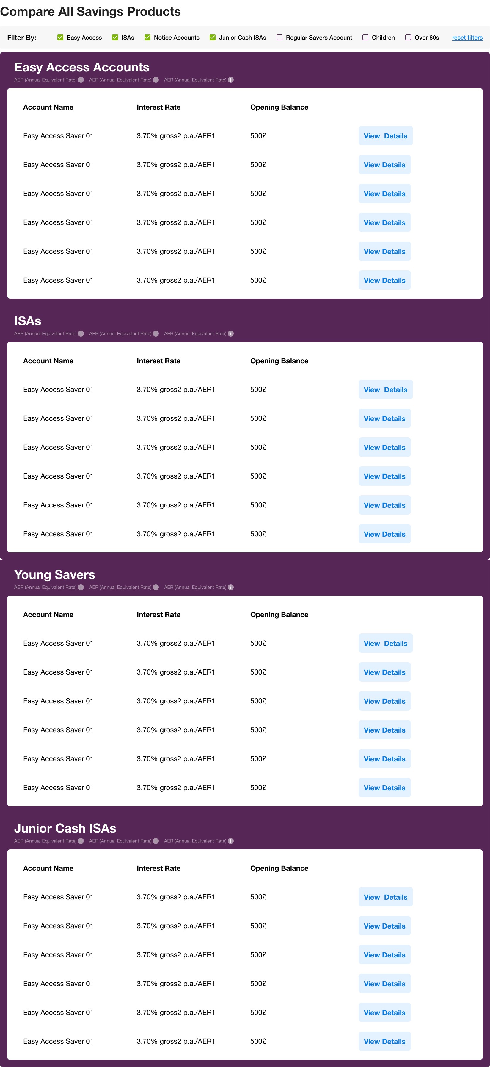
Allow users to compare key features like interest rates, fees, and opening account balance to identify the best fit for their needs.
Adding filters with checkboxes on the Compare page would help users selectively compare products with each other.
Competitive Analysis
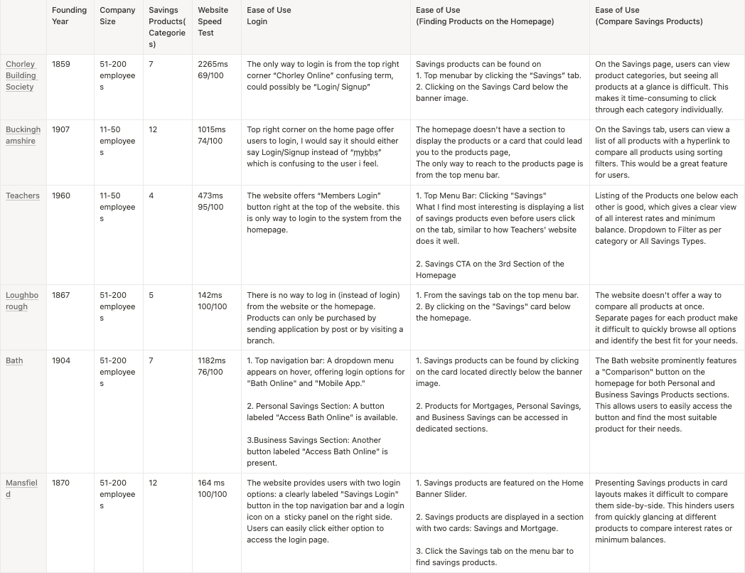
This analysis compares Chorley Building Society to similar small building societies. By studying and comparing these platforms, we can identify Chorley Building Society's position in the market and potential areas for improvement.
Card Sorting
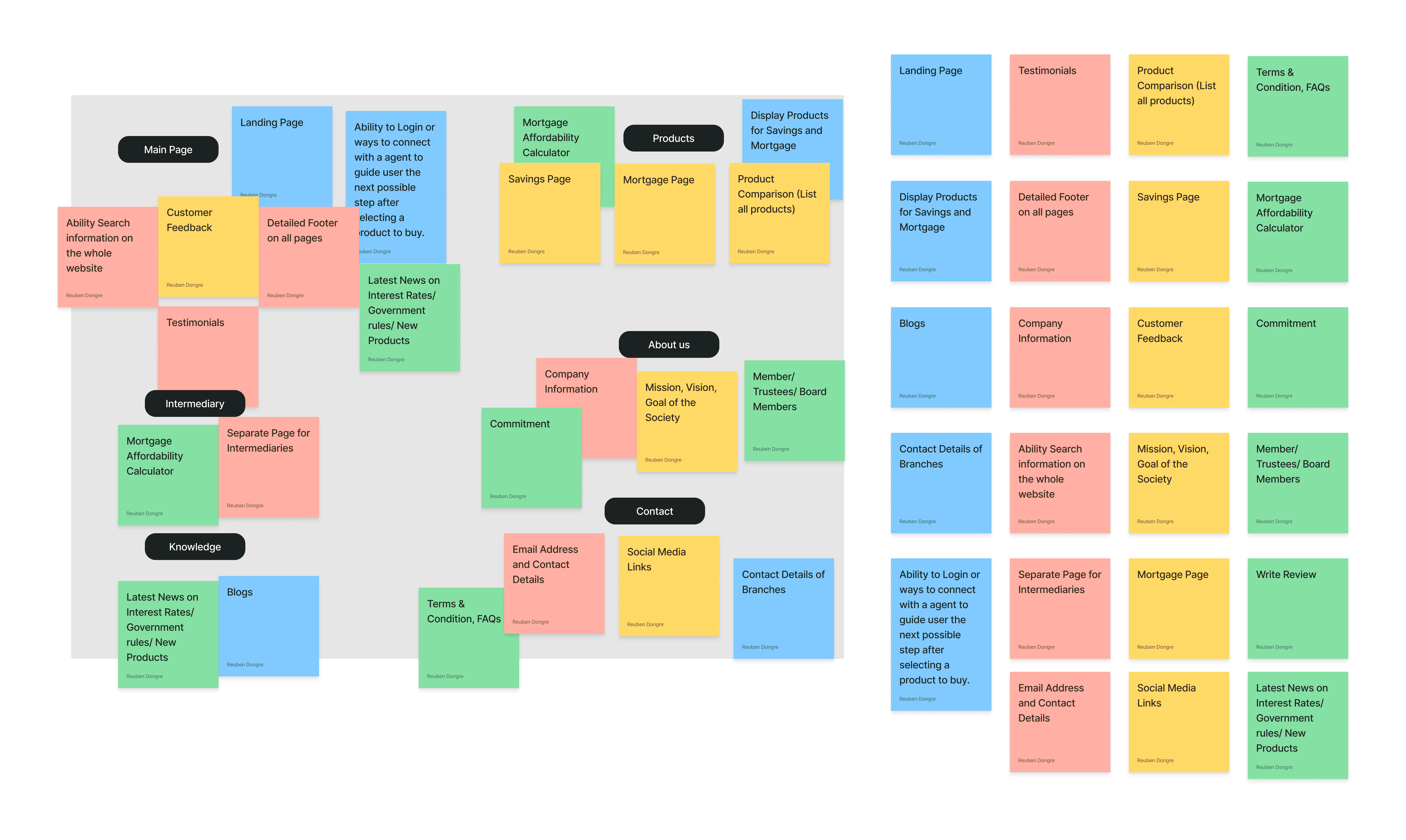
The card sorting exercise, which helps us understand users' mental models, was conducted to gather all website ideas, features, and content. By sorting these elements and grouping similar ones, we can identify the 'must-have,' 'could-have,' and 'would-have' features for the website.
Users
”Since our formation in 1859, to help local mill workers buy their homes, Chorley Building Society has built a solid foundation on making a difference to the lives of our members and the local community.” About us Page
Target Users:
First-time savers: Looking for a safe and convenient way to save money.
Existing savers: Seeking better interest rates or product features.
First-time homebuyers: Navigating the mortgage application process for the first time.
Existing homeowners: Considering remortgaging or seeking better mortgage deals.
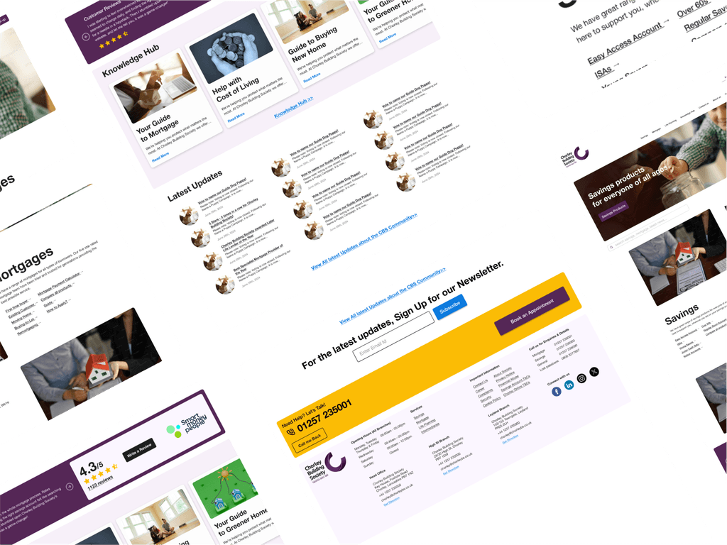
High Fidelity Designs
Outcome / Result
By addressing the user needs, the new design can benefit both Chorley Building Society and its customers.
A friendly and intuitive platform will help users feel confident in their choices and enhance their overall joy!
Clear and accessible information can lead to educating users and making sure their confident in making decision about savings and mortgage products.
A good user experience can strengthen Chorley Building Society's image and attract new customers.
Conclusion
Investing in a user-centered approach to design can significantly improve Chorley Building Society's online platform and empower users to make informed financial decisions. By focusing on clarity, transparency, and user-friendly tools, Chorley Building Society can build stronger customer relationships and achieve its business goals.
reubendongre
Copyright© 2025.
