UI & UX
Redwood Bank
Overview
For Redwood Bank, I led a UX analysis and redesign of their existing website. My approach focused on enhancing usability and visual appeal to create a more intuitive, user-friendly experience. Through a blend of strategic analysis and creative design, I delivered solutions that improved user navigation, aligned with the brand’s identity, and elevated overall engagement on the platform.
UX Review
Banner Image
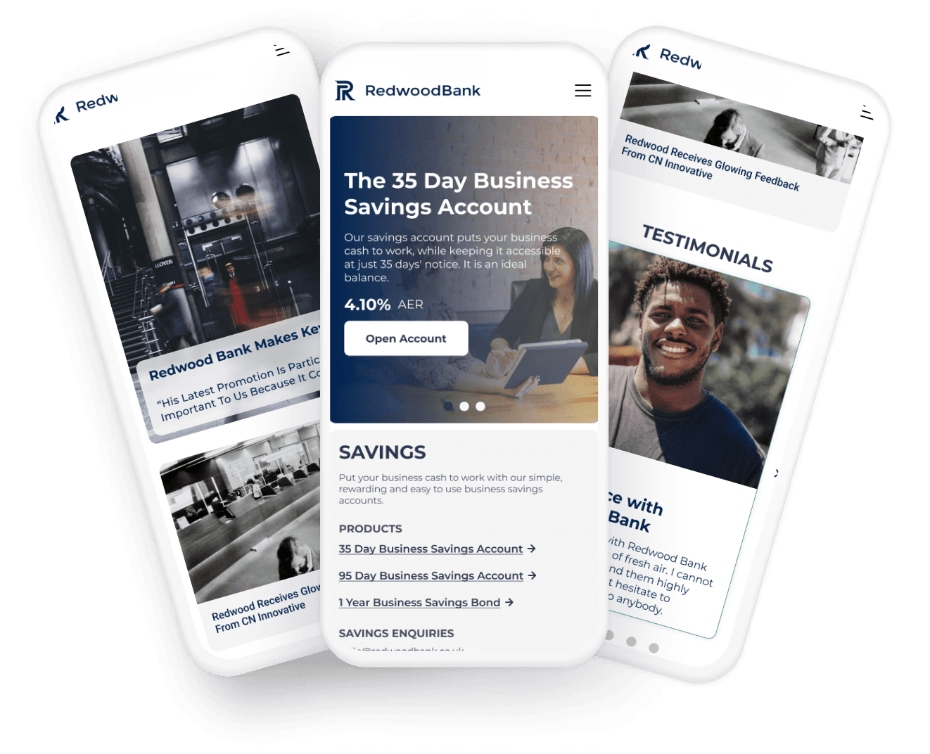
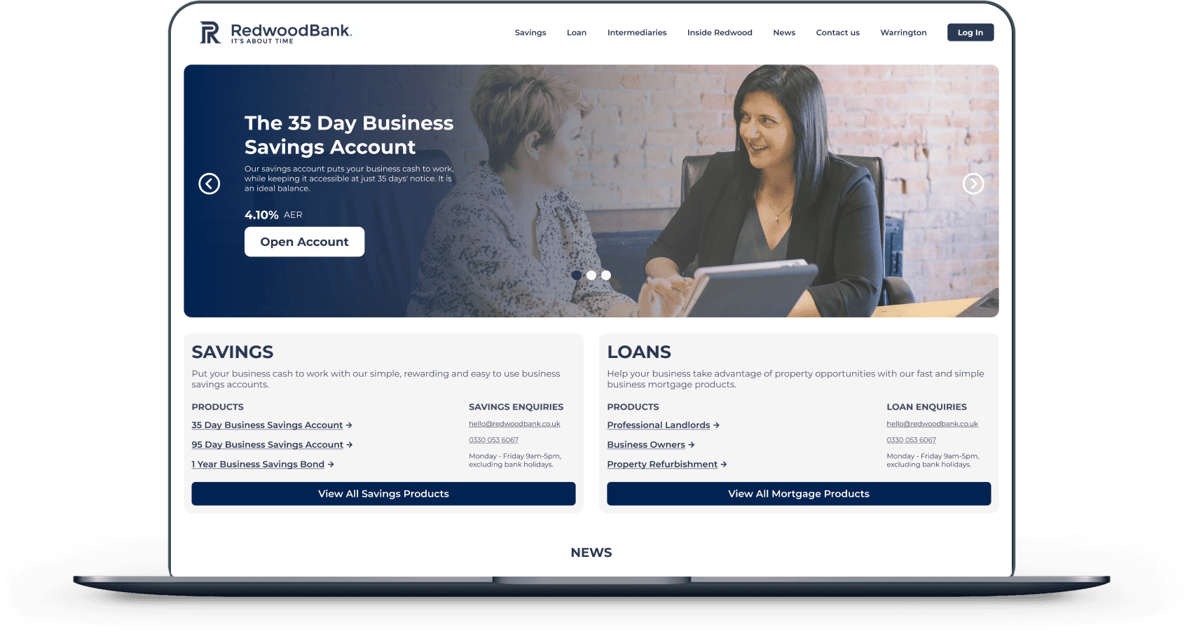
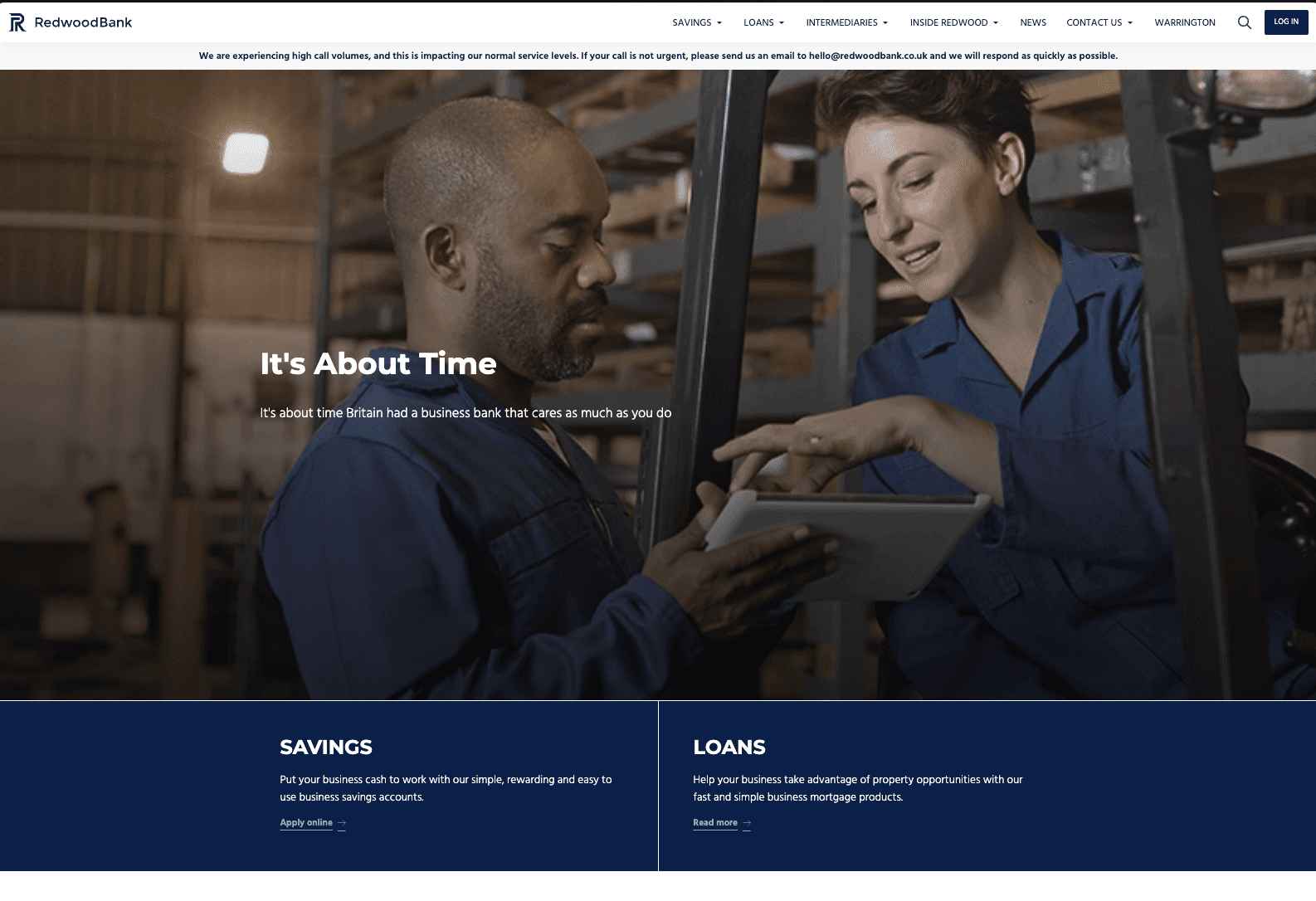
The banner image occupies more than 70% of the screen, leaving very little space for displaying products and information for user interaction.
Taller banner images tend to push content further down the page. If users cannot quickly find the information they are seeking, they might leave the site, which can increase bounce rates by 10% to 30%.
Savings & Loans
Having a darker background and a small CTA button doesn’t really catch attention and could be easily missed by the users.
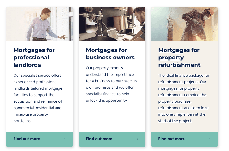
The Apply Online and Read more buttons seemed to be to have an issue on hover the arrow pops out of the button. also in consistency with one being “Apply Online” and the Other being “Read More” as per the WCAG Guideline links to be more explanatory telling exactly where is it is going to lead the user.
If a user wants to access a product, they will first need to navigate to the main products page and then search for the product they are interested in.
Inside Redwood
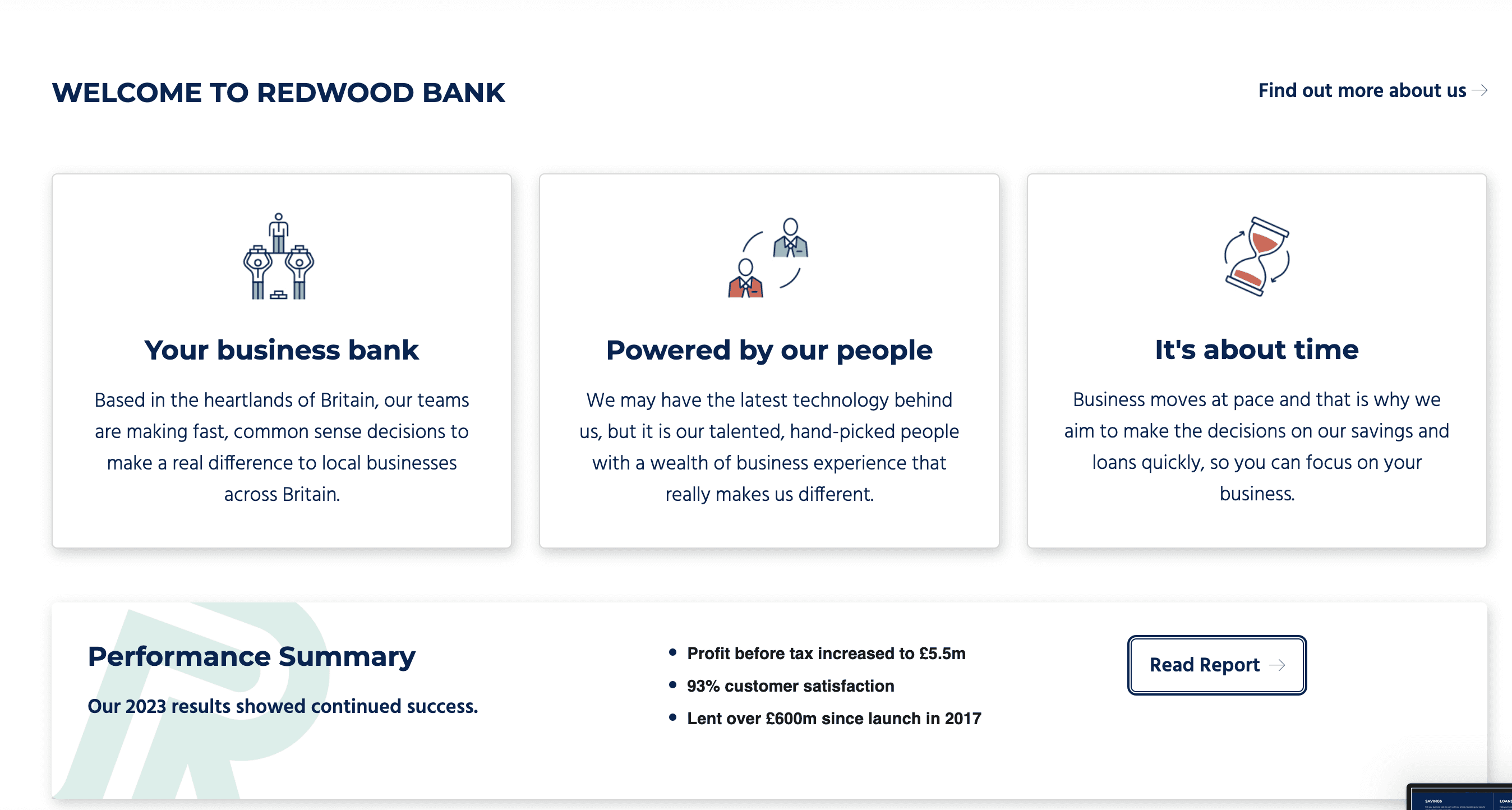
There is some inconsistency with the drop shadows when comparing the top three cards to the one below.
The buttons have rounded edges, but the cards don’t have enough border radius to match this styling.
Since drop shadows are used for the Savings & Loans Products and the News Articles, which are clickable, the 'Inside Redwood' section gives the impression that each card is also clickable, though that’s not the case.
The “Performance Summary” text is centered and appears in black, while the rest of the text is in blue, creating a colour inconsistency.
Previous Rates
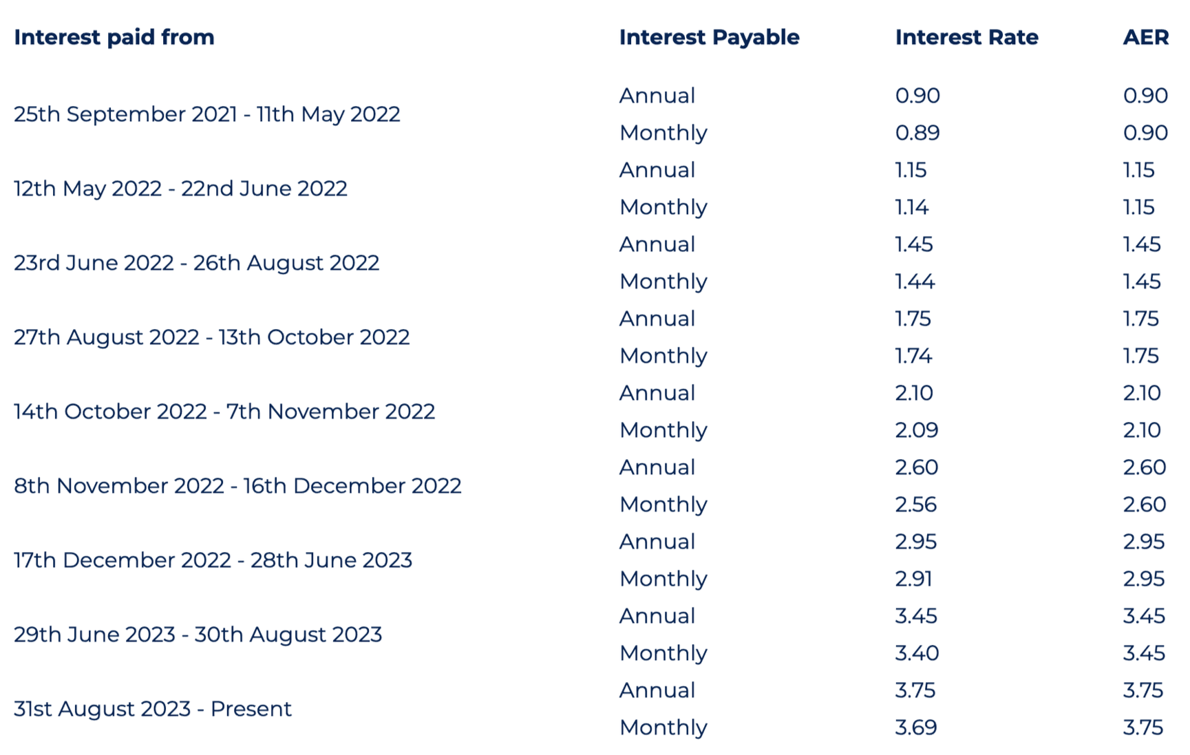
Having both 'Interest Payable Annual' and 'Interest Payable Monthly' in the same column could be confusing for users, especially when reviewing a long list of table items. It may be unclear which rate corresponds to the annual and which to the monthly.
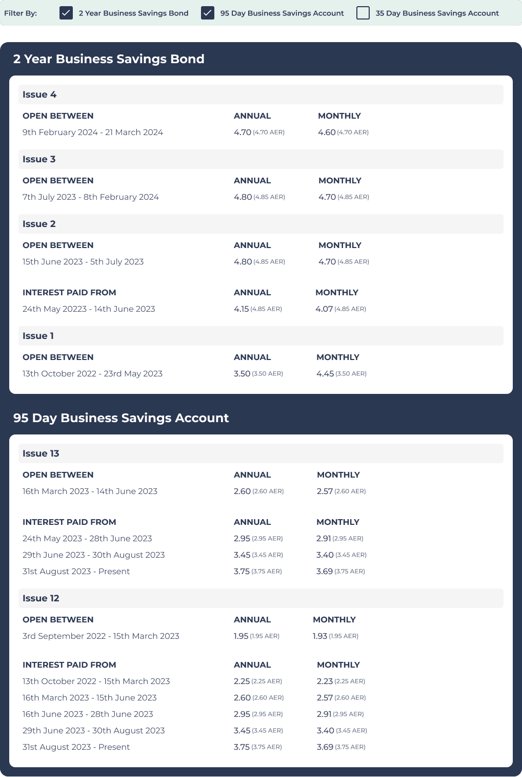
The 'Previous Rates' page table lacks filters, making it difficult to select and compare a few options. Additionally, there's no clear indication of how many products or sub-products fall under the savings category.
Footer
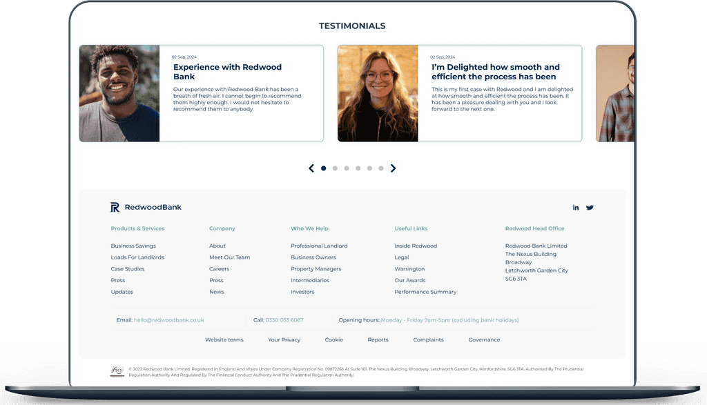
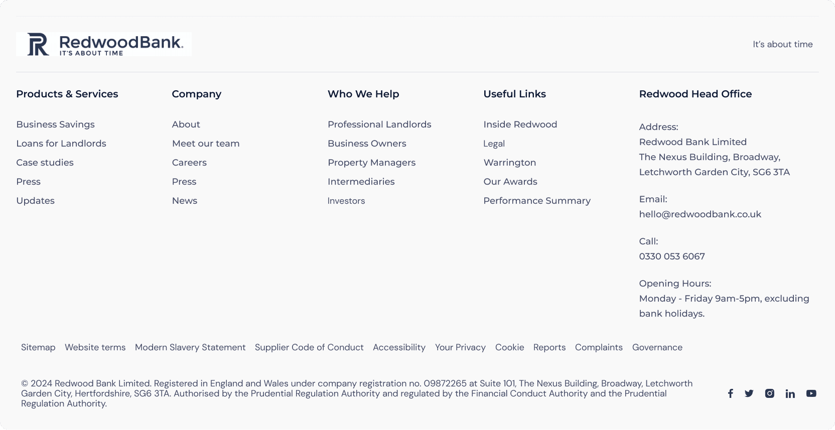
The footer currently appears quite sparse, with minimal information on the left and social links on the right, leaving the middle section empty. Enhancing the footer with additional, relevant information could make it more intuitive and visually appealing, creating a fuller and more engaging design.
Images on Products
There is an inconsistency between the Savings and Loans pages, as the Loan products have images displayed on each product, while the Savings products do not have images displayed.
Inconsistency with Components & Interactions
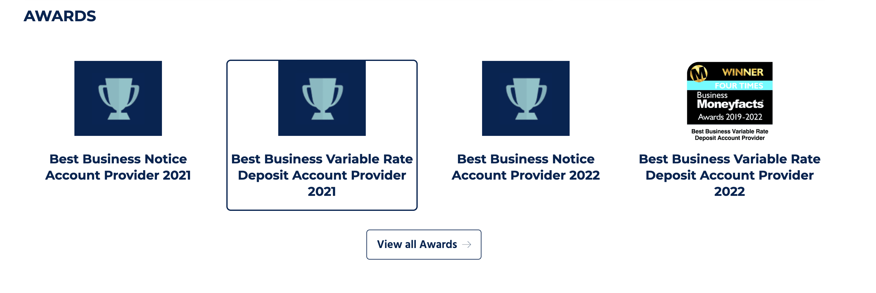
The awards inside the “Awards” section are clickable elements, but when hovered on there is no interaction, also when clicked all awards leads to the same page confusing the users thinking if they opened the same page that was viewed previously.
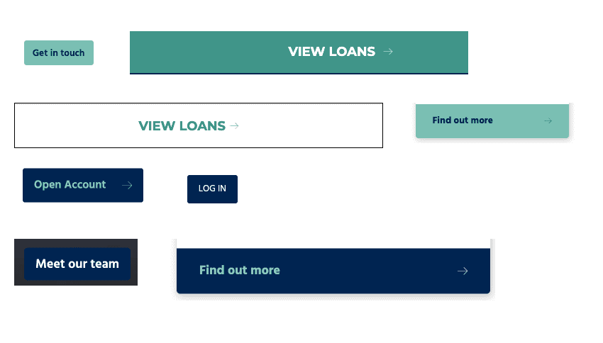
Button are in consistent with the colours & interactions, font sizes vary as well.
Competitive Analysis
Brighter Banner Image
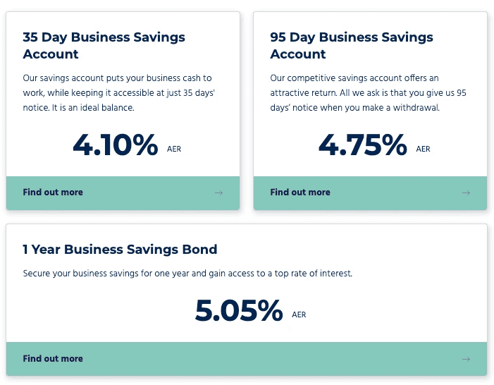
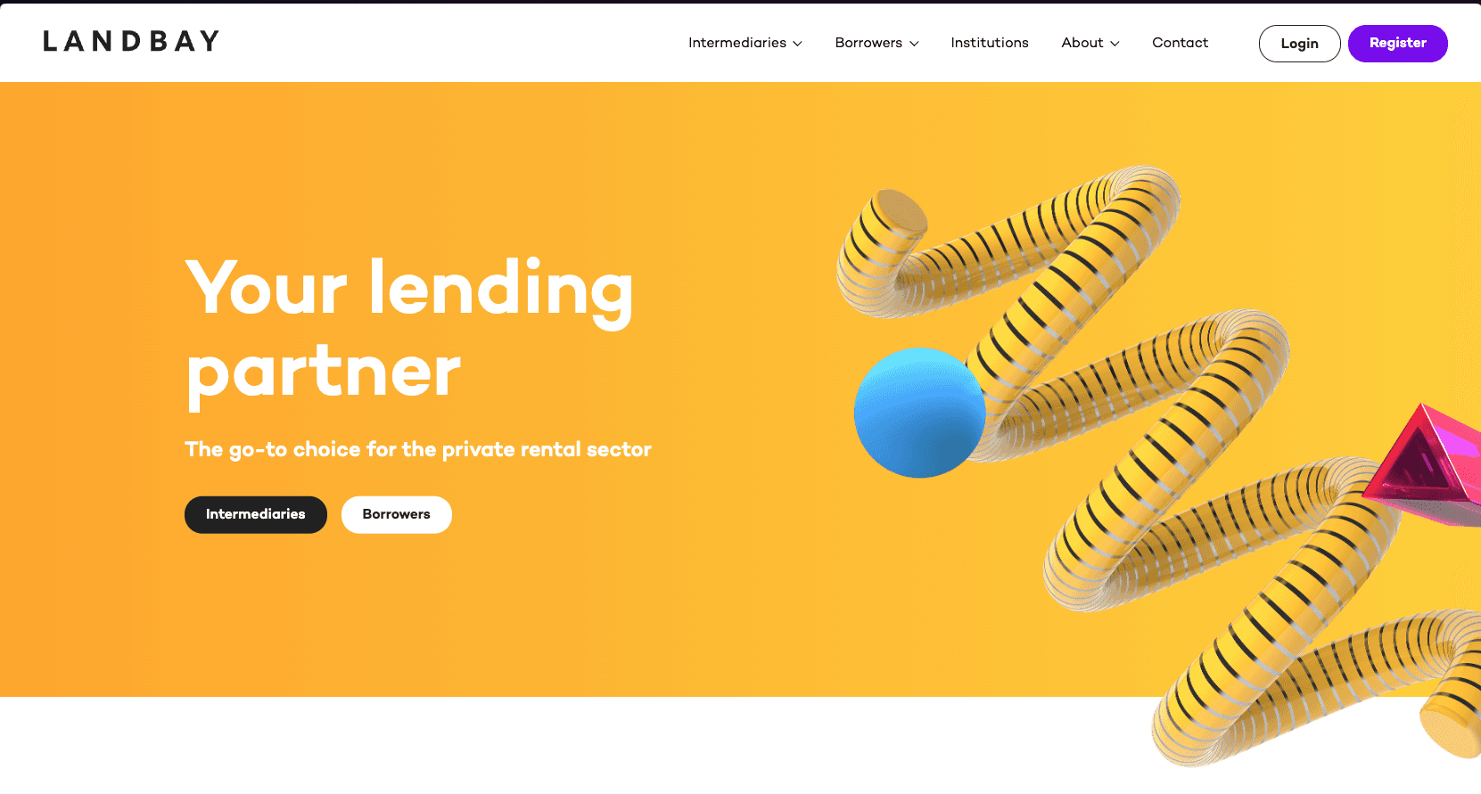
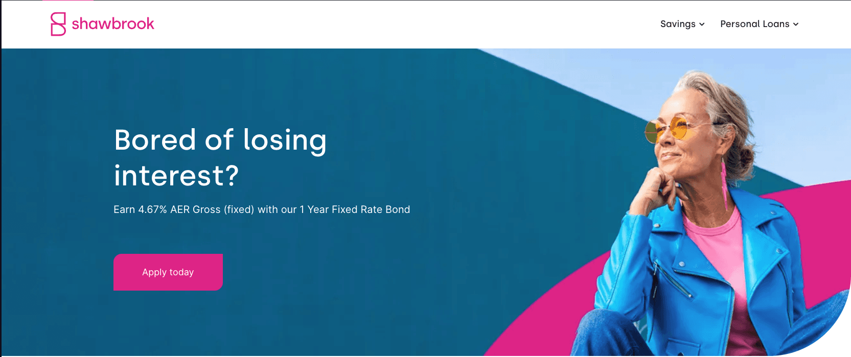
Shawbrook & Landbay has bright banner image, they can be eye-catching and make them more likely to notice.
A good bright image could lead to strong first impression, Also can make the site look modern and visually appealing.
Personalisation
It’s quite interesting to see that Shawbrook has dedicated the top bar to three types of users: Personal, Business, and Property Finance. Each type has its own tailored landing page, which is quite engaging.
Rather than having a single page for all user types, it might be even more intriguing to see further personalization for each type, enhancing the landing page and menu bar experience.
Footer with better use-case
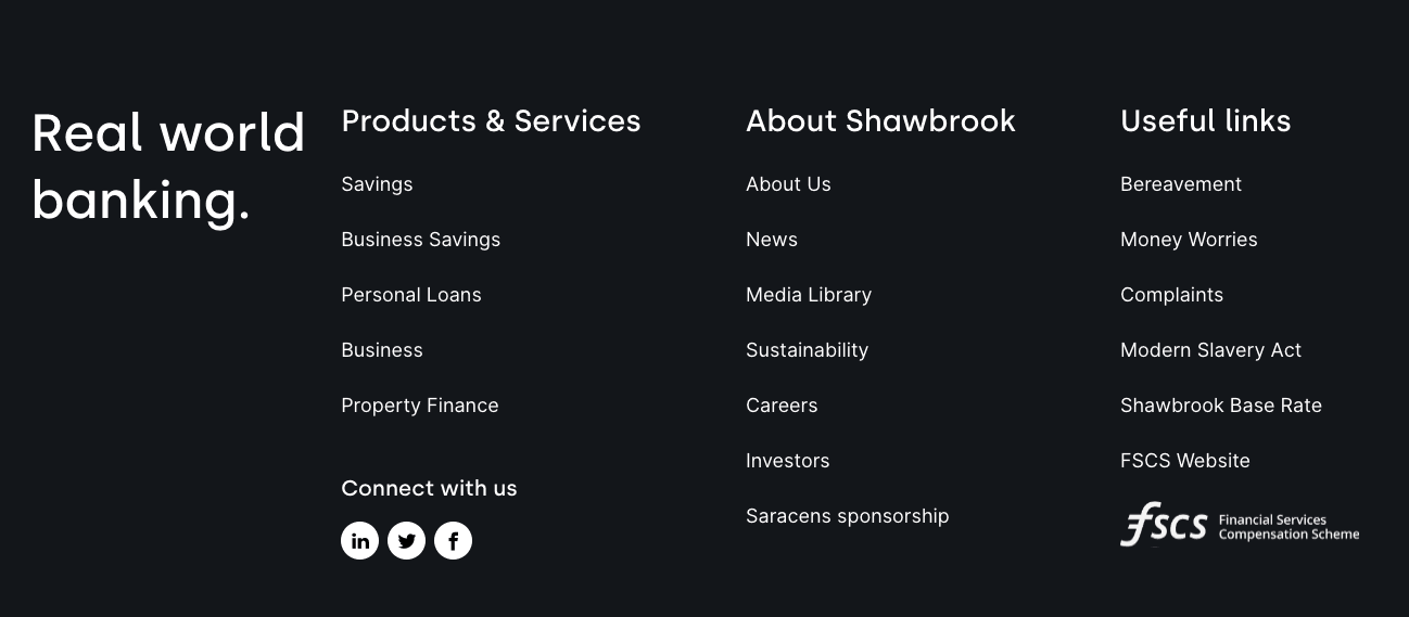
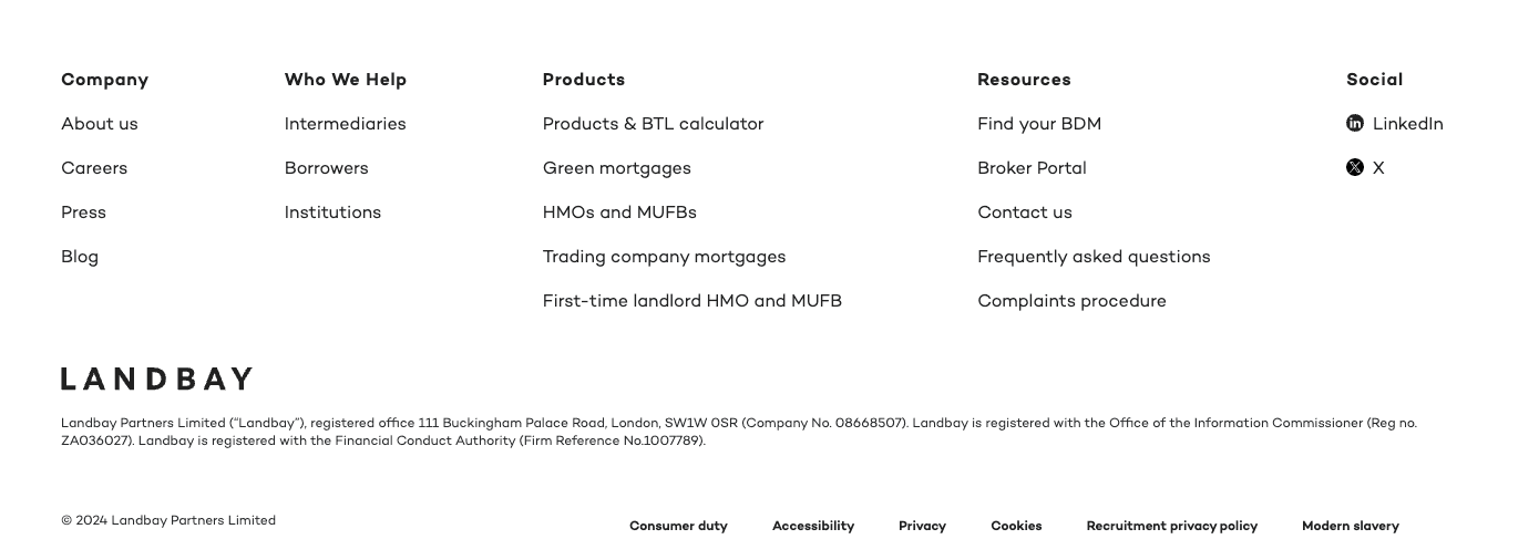
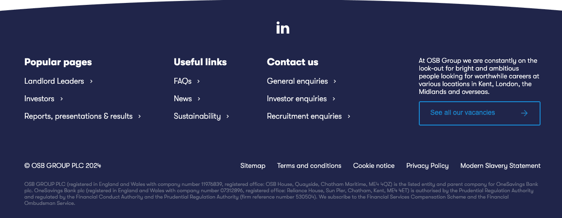
Landbay, Shawbrook, and the OSB Group all feature intuitive and well-balanced footers with a wealth of information. This layout allows users to quickly glance and find relevant links more efficiently, enhancing the overall user experience.
Metrics on Landing Page
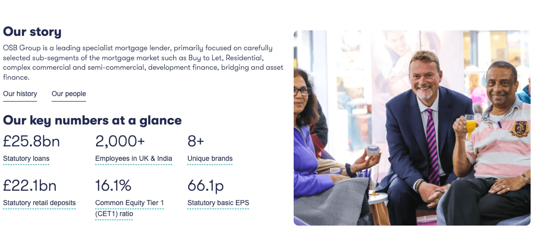
It was interesting to see OSB Group sharing their story on the homepage, including details such as the number of employees, brands, and loan amounts. A quick glance at such information can build credibility and demonstrate that the company is well-regarded and widely accepted.
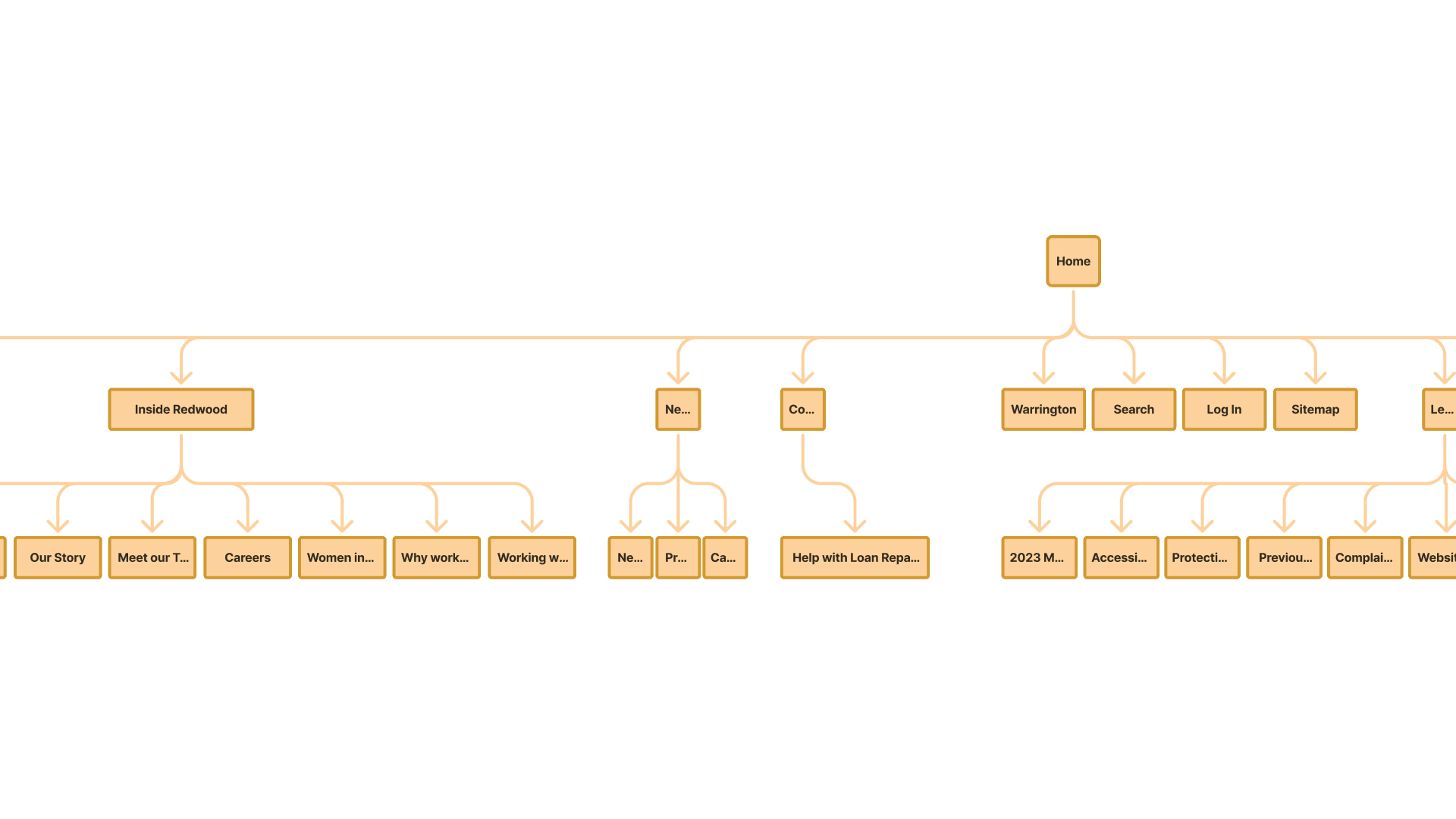
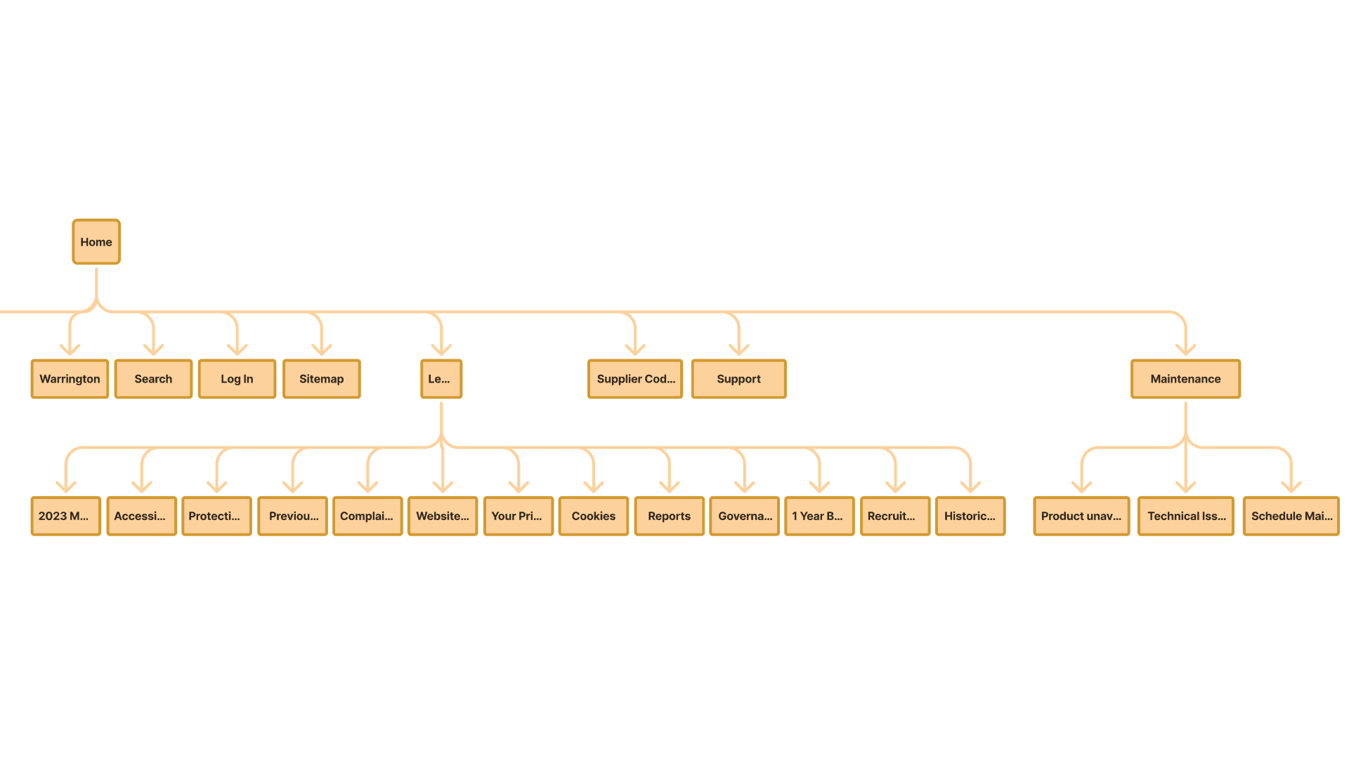
Site Map
reubendongre
Copyright© 2025.
